


Store Front Thoughts From A Former Sales Associate
The Role of Retail Displays in the Digital Age

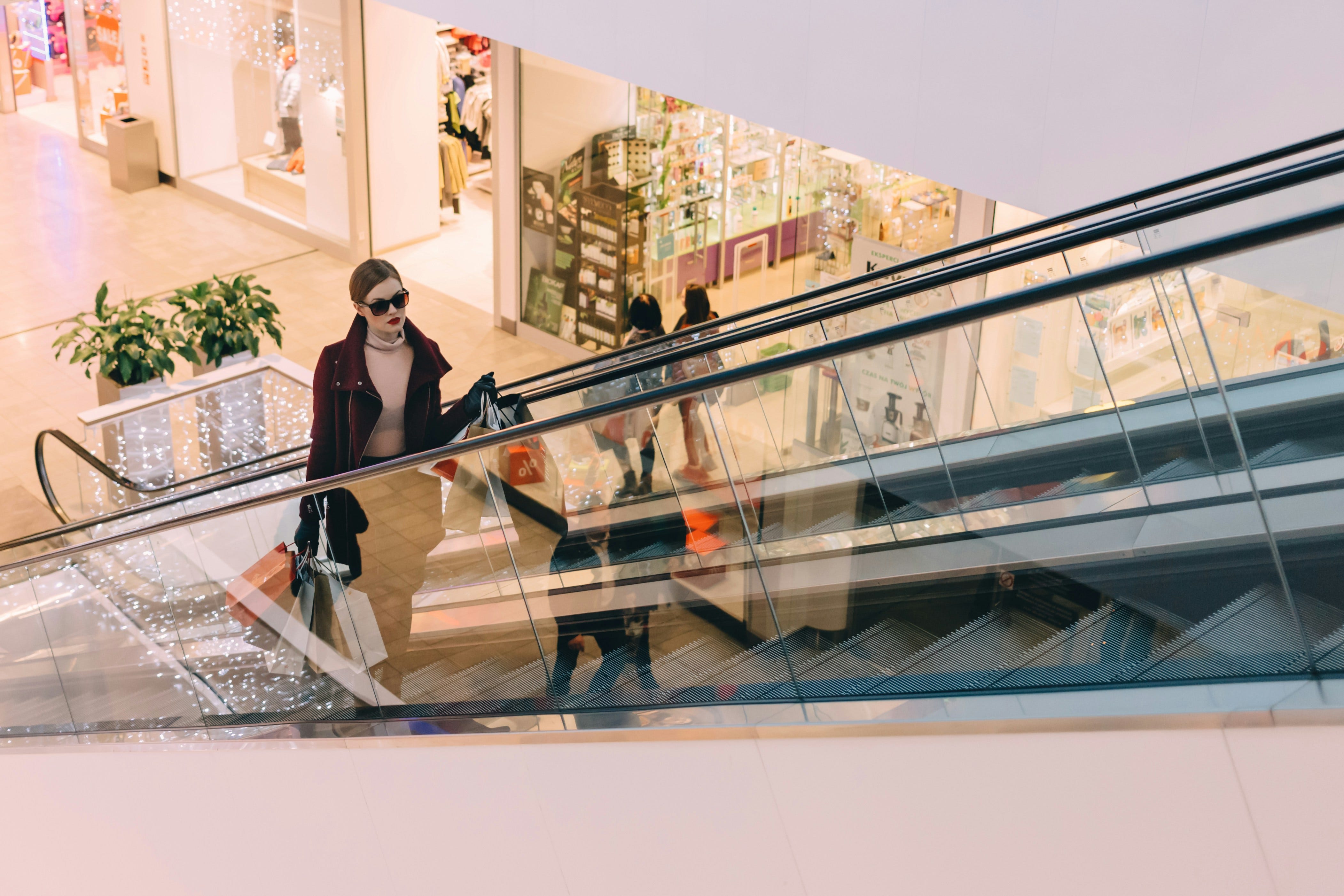
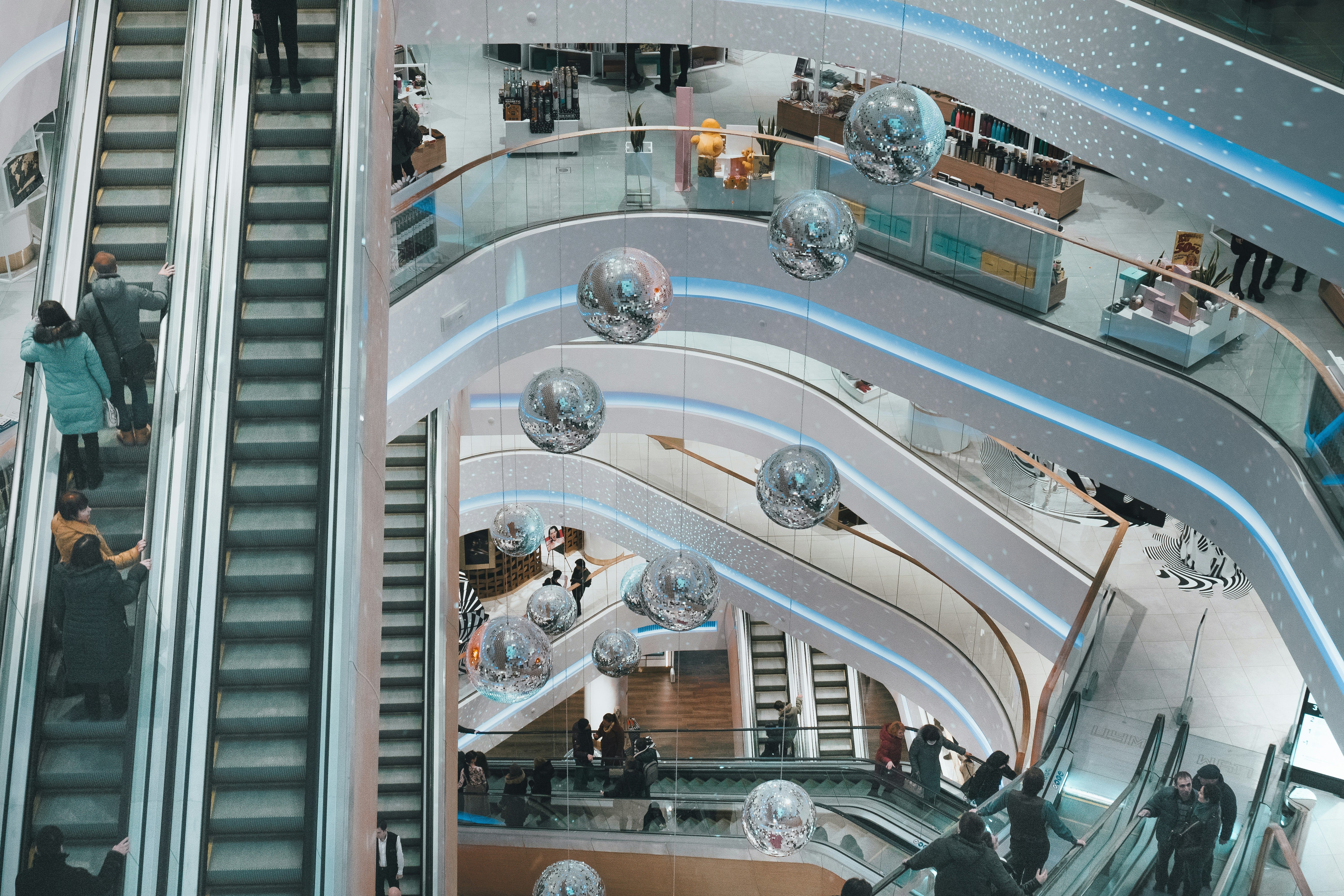
If you're into interior design, it may be a good idea that one weekend when you have nothing going on to make a spreadsheet of all the store fronts in your area as I have. I would not say that interior design has never been either focus or talent of mine but since the nature of design is very fluid, I figured that there are lessons to be learned from this field of design.
A store front is the physical face of a brand. Big bay windows and flashy mannequins convey what the services it offers, its target audience, and sets the tone for any customer intrigued enough to venture inside. As user experience designers, reflecting on how store faces convey their brand identity physically provides us unique insight into how we might translate it onto the online context.
There are clear indications of identity through terminology in the logo design (restaurants usually specify cuisine type in a subheading) and big windows are standard as they serve to cut through the fluff and get straight to the product. But what if the products are too small to view from across the street? What if the store is overshadowed by its neighbors? It would be a stretch to suggest that a company add an extra word to their name.
So store owners and interior designers must be creative: how do you convey a brand's uniqueness in subpar conditions within seconds of someone passing by? Here are a couple of learnings:
Recently, I was working on the website redesign of a local Bay Area retail company. One afternoon while visiting their San Francisco location I thought to myself: Wow! This is a really awesome brand, too bad I can't read their logo.
For context their logo incorporated large white bubble letters highlighted with a light pink stroke. Even when purposely stepping outside to figure out what I should type into a Google search, my eyes strained to read the letters. I also thought it would be rude to ask one of the associates what their store was called.
However, while speaking to their staff and sending over an email to their headquarters in San Mateo, I offered to help them if they'd have me. I was excited about the potential of the project and expressed my admiration for their service which provided a physical space for artisan good using a B2B digital framework.
I got an email back from them the next day and they too saw the opportunity for growth. We were off!
The scope of my role involved improving their online presence while establishing their brand character to bring on new clients. We sought to create a line of consistency between their physical locations and the website. Developing their web presence was crucial for growth since client artisans would sign up for their program entirely online. So whether they had any products available in their store was completely dependent on their web presence!
So when I was walking around that one free weekend, I was compelled to take note of what other brands were doing, separate from the project. Sort of like a mini competitor analysis out of professional curiosity.
Stationaries tended to have a crafty, stitched together store front, leaning into the actual display. This makes sense considering the variety and size of their products which are typically quite small.
Clothing brands opted for mannequins also leaning heavily into their display. Pizzerias usually incorporated some sort of triangle into their store front. Candy stores often went the stationary route with a delicately crafted set in the window.
But then I saw certain ones that didn't work: a dispensary that I thought was a flower shop or a jewelry store that reminded me of a wood shop. What do people think of first when they think about these types of stores? Small objects are usually easier to present online because you can scale up the size. What makes you think "thats obviously a jewelry store" from half a mile away?
For instance, a motif present in many a candy store is the big jar, so often employed in traditional boutiques and movies like Willy Wonka. This symbol has been established in our mind by the culture or personal experience to mean candy. They have been linked in our brains. As user experience professionals we must keep these connection in mind when creating interfaces that resonate with people in addition to being usable.
Seeing these through lines and leveraging them to align with unique brand
identities is important both physically as well as digitally.