


Lorum Ipsum, Or Should I Say: Blah, Blah, Blah?
Addressing The Importance of Typography

Understanding how to use typography is an essential skill of every great designer. How do you communicate the point as powerfully as possible in as few words as possible?
I think back to the film courses that I took in my undergrad. A rule of thumb for conveying information visually is to “show not tell”. Analyzing lengthy scenes without dialogue allowed me to cut to the heart of visual storytelling so that I can apply it into the field of design.
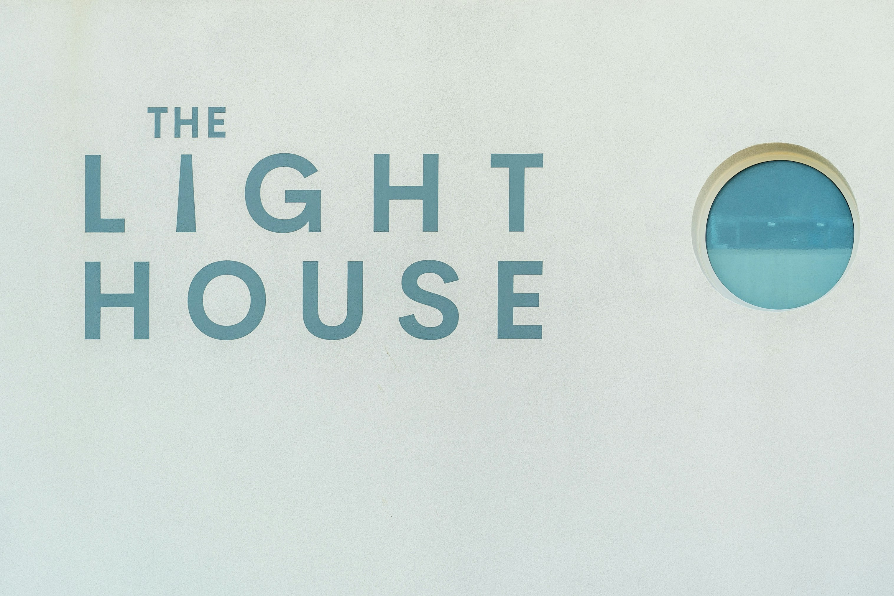
Yet typography is a critical tool for every designer. Even today as I took my lunchtime stroll around the Haight-Ashbury of San Francisco, I was struck by an immerse print on the side of a white-walled apartment complex: LEARN FROM THIS.
The text was displayed in a black, bold, sans serif with piercing strokes of white. Impactful, intriguing, and most importantly: I still vividly remember it as I’m writing this at midnight the next morning.
I think now that if those words were displayed in a different way, would I have even noticed them? What if it was orange or blue? What if it was written in Pacifico or Lobster? What if it didn’t say anything at all?
Lorum ipsum, as many designers know is placeholder text. I usually generate meaningless text on some website to allow me to start designing before without thinking too deeply about the text which would be altered in post upon the final deliverable. But thinking about how to communicate solely through font choices and lettering can be equally as important as the words we choose to replace it with. Fonts and weights have their own meanings buried within them.
For instance, serif fonts are usually associated with more traditional boutiques while sans serif is associated more with modern, minimal design. When considering what you are designing for, you must consider which fonts accurately convey the message without being distracting.
In a study from H. Song et al., they studied the perceived difficulty in completing a task after it was read in an easy font (Arial) and a difficult font (Brush). Participants were instructed to rate their willingness to do the task as well as the easiness of the task out of 7, with 7 being easiest and meaning they would want to do it. The first test was reading an exercise routine and the second a cooking recipe.
They found a direct correlation between the difficulty in reading a task and the participants’ willingness to conduct the task, where the harder something is to read the less likely we’d want to do it. This was based on the principle of least effort where we tend to be more drawn to doing actions that require less effort, but this all still holds significance especially in the discipline of UX.
Font psychology is a growing field and as new interfaces arise and as new typefaces are made, we must become our own psychologists and understand how the fonts we use impact the users who read them.
I’d probably be less incentivized to press the like Subscribe button on a Youtube video, if it was written in Comic Sans.